
Exec Summary
After many years in the energy industry, I set out to build a deep learning model to improve day-ahead demand forecasting accuracy for electricity market participants. After testing several algorithms against a baseline forecasting benchmark, the best model beat the benchmark accuracy by 22%. The estimated financial benefit to the network operator is 26% or GBP112 in one day for the five thousand customer cohort. That’s GBP0.02 per customer per day. You can find all the code and run the models here. Thanks to Aaron Epel and James Skinner for their thoughtful collaboration on this project.
Data Set
The dataset is a time series of two years of half-hourly smart meter data readings from five thousand residences that participated in the Low Carbon London project. It weighs in at about 10GB and 167 million rows. Credit to UK Power Networks for making this data available here. I ended up sourcing the data from here, because the authors kindly did the work to package it up with useful weather data.
Exploratory Data Analysis
I created a number of visualizations that revealed a lot about the data, and uncovered a number of quality problems.
This chart helps us get a feel for the overall shape and seasonality of our target, the aggregate load across all meters in the cohort. The moving average and standard deviation make clear the London winter electric heating demand peak and summer trough.

When we look at the curve for the number of meters, you can see the recruitment phase at the start of the project where new households are being added until a peak number of 5,533 was reached. Then there’s a gradual decline through natural attrition until the end of the project. The recruitment phase correlates nicely with the ramp up in aggregate load in the previous chart.

Also note several sharp dips interrupting the curve, which correspond to missing data for many meters at that time. These could indicate power outages impacting those meters, or a problem collecting or retaining the data.
This heat map is very useful for assessing the quality and completeness of the smart meter data. A 2% random sample of the meters is sufficient for these purposes, and reveals some useful insights.

The Y axis lists the smart meter identifiers in the sample. The X axis represents time: an approximately two year period. The intensity of the pink/peach lines indicate usage in kWh per half-hour.
White represents no data for a meter. The wedge of white on the left shows that meters were gradually added over time during the recruitment phase, not all at once at the start. The long stripes of white on the right hand side shows attrition of some meters leaving the program.
The thin white lines show intermittent missing meter reads, some of which we will deal with in the next section.
There are a number of instances where many meters have missing readings at the same time, indicating a wider impact event, possibly a power outage. These are a different view on the sharp dips we observed in the meter growth curve above.
Zooming in to build an understanding of the daily load profile, this next chart shows average daily load profiles for the sample meters in gray, and the average daily load profile for all five thousand meters in blue.

There’s a wide variation across individual meters, but the average shows an overnight trough, midday plateau and evening peak.
Data Clean Up
The analysis revealed a number of data problems and issues that I cleaned up.
- Filled in some intermittent missing smart meter readings using interpolation. I took a conservative approach, limiting interpolation to a maximum of 2 values between existing legitimate values.
- Removed all the meter reading records that were not exactly on the half-hour sampling cadence. Turns out all of these were null readings anyway.
- The weather dataset is on an hourly cadence, so re-sampled with linear interpolation to match up with the 30 minute sample rate of the smart meter data.
Feature Engineering
Here is the set of candidate features I built to train the models…
Aggregate Features
- Sum of load from all meters
- This is the prediction target “Aggregate Load” for our model
- Count of meters contributing to the load
- Maximum temperature for the day
- Minimum temperature for the day
Cyclically encoded features to help the models learn various energy demand patterns
- Minute of day
- Day of week
- Week of year
Lag Features
- Aggregate load, 1 week lag
- Aggregate load, 1 day lag
- Aggregate load, 1 half-hour lag
- Aggregate load, change from 1 week ago
- Aggregate load, change from 1 day ago
- Aggregate load, change from 1 half-hour ago
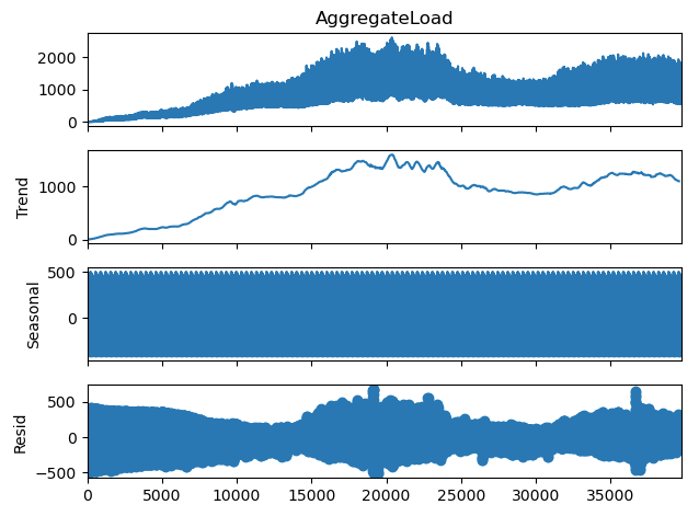
Seasonal decomposition features
- Daily trend, seasonal and residual
- Weekly trend, seasonal and residual
- here’s how the components break down…
In addition, we used these basic candidate weather features that required no special engineering.
- Temperature
- Dew point
- Pressure
- Humidity
Data Pre-Processing and Preparation
Here are some of the other fundamental data preparation and pre-processing steps.
- Standardized the data to promote convergence of the model
- Processed the time series training dataset into a series of data window pairs. One contains 48 time steps of input features. The other consists of the target labels: 48 time steps of aggregate load for our 24 hour forecast window.
- Split the dataset for the purposes of model training and validation in two three segments by time: training 70%, validation 20% and test 10%.
Feature Selection
I used permutation feature importance to pair back the feature set, removing features with negative importance to maximize the accuracy and efficiency of the models. For example, after getting these feature importances from one experiment, I removed yearlySeasonal, numMeters, minuteOfDay and AggregateLoad_weekdiff features for the next model iteration.

After several rounds of feature selection, these are the feature distributions of the set of features that yielded the most accurate models.

Baseline Forecasting Algorithm
I used a simple naive one week persistence model as the baseline for evaluating the other models. A one week persistence model predicts the load will be the same as it was for the same period exactly one week earlier. This provides a fairly good baseline because the daily load profile from one week ago intuitively should be relatively similar to today. It will capture much of the intra-day load pattern and variation due to day of the week, for example the differences between weekdays and weekend days. It will also capture most of the seasonal load variation, because there will be relatively little seasonal variation over one week.
Build and Train Candidate Models
For this experiment I was particularly interested in testing a number of deep learning algorithms to find out how a simple Keras implementation of each would perform on this problem. Specifically, I trained two neural network models not specially designed for sequential or time series data…
- Multi Layer Perceptron (MLP)
- Convolutional Neural Network (CNN)
And three specifically designed for sequential or time series data…
- Recurrent Neural Network (RNN)
- Long Short Term Memory (LSTM)
- Gated Recurrent Unit (GRU)
I was curious to find out how much more accurate the sequential models were than the non sequential models.
All the code, including training and running the models is available here.
Model Evaluation, Selection and Results
Here are the accuracy results for the models measured as Mean Absolute Error when applied to the validation and test sets respectively.
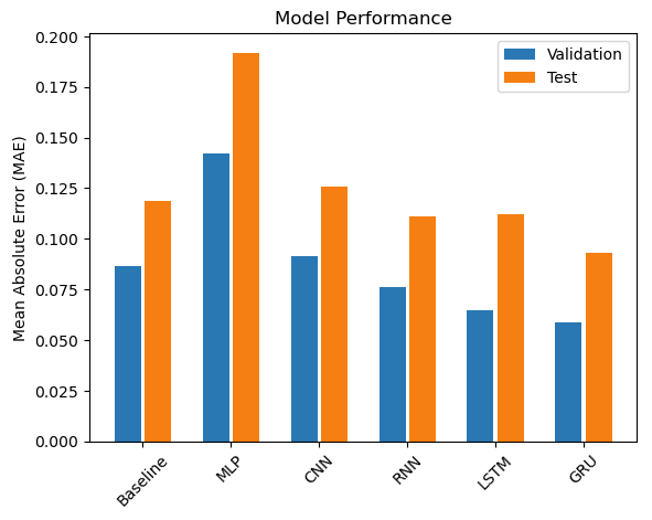
The baseline one week persistence model gave us an accuracy measured as Mean Absolute Error (MAE) of 0.119 for the test dataset. The Gated Recurring Unit (GRU) model had the highest accuracy of our candidate models, with MAE of 0.087, which beat the baseline by a hefty 22%.
| Model Algorithm | Error (MAE) | % -decrease or increase in error relative to Baseline |
| GRU | 0.093 | -22% |
| RNN | 0.111 | -6% |
| LSTM | 0.112 | -6% |
| Baseline | 0.119 | 0% |
| CNN | 0.126 | +6% |
| MLP | 0.192 | +62% |
These results are averaged across the whole of the test dataset. Let’s take a look at what this performance of the winning GRU model looks like for a specific day, in this case the first day of the test dataset, November 27, 2013:

For this day, the MAE of the GRU prediction is 57kWh, a 25% improvement over the baseline prediction with MAE of 75kWh.
Financial Impact
Accuracy of day ahead forecasts have significant financial impacts on electricity market participants. I’m using a simplified approach to quantify the impact in financial terms for a network operator on a specific day. For under forecasting a given hour on their day ahead forecast, they pay a penalty of buying the shortfall at the real-time price at that hour. For overestimating a given hour, their penalty is the day ahead price for that hour times the overforecast amount.
The Nord Pool site doesn’t have price curves back as far as November 27, 2013, so here’s a good analog pricing curve from November 24, 2022:
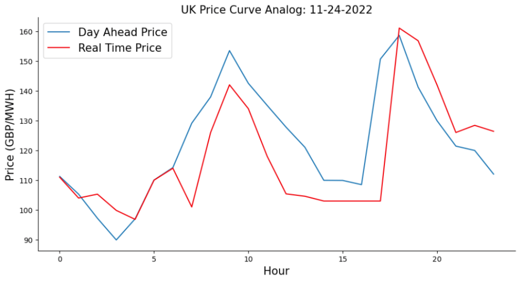
Using this approach, the improved accuracy of the GRU model compared to the baseline model yielded GBP112 or 26% for the network operator in one day for the five thousand customers in this cohort. Another way of expressing that is GBP0.02 per day per customer.
| Forecast error cost for one day (GBP) | Number of customers | Forecast error cost per electricity customer for one day (GBP) | |
| Baseline | 436 | 4,987 | 0.09 |
| GRU Model | 323 | 4,987 | 0.06 |
| Incremental Benefit | 112 | 4,987 | 0.02 |
Conclusion
Several simple recurrent deep learning models, including RNN, LSTM and GRU, had significantly better accuracy than a one week persistence baseline. The GRU model performed the best, beating the baseline MAE by 22%.
The CNN and MLP models did not fare as well, lagging the baseline MAE by 6% and 62% respectively.
When compared to the baseline, applying the GRU model yields an estimated financial benefit of GBP112 or 26% to the network operator in the first day for the five thousand customer cohort. That’s GBP0.02 per customer for that day.
Future work
- Cluster analysis to group meters by similar demand profiles
- Forecasts for individual homes, not just the aggregate across all homes
- Systematic feature evaluation / selection
- Add a candidate linear regression model for comparison
- For the MLP model candidate, experiment with more hidden units and hidden layers to see if a larger, deeper model will have better accuracy
References
- SmartMeter Energy Consumption Data in London Households
- Smart meters in London
- Time series forecasting | TensorFlow Core
- Georgios Tziolis, Chrysovalantis Spanias, Maria Theodoride, Spyros Theocharides, Javier Lopez-Lorente, Andreas Livera, George Makrides, George E. Georghiou Short-term electric net load forecasting for solar-integrated distribution systems based on Bayesian neural networks and statistical post-processing – ScienceDirect, Energy, Volume 271, 2023, 127018, ISSN 0360-5442
- Nord Pool Group Market Data
- Notebook for code, models and analysis
